What does this have to do with guidelines? As an amateur calligrapher, pencil guidelines help my calligraphy look better. They are erased when I'm done, leaving straight, evenly-spaced text that matches the appearance of the work of professional period scribes. This article is about the modern tools and shortcuts I use to help me get my projects done, not the medieval methods.
Because of the length of this article, I've divided it into sections to allow you to skip ahead to the subject that interests you, or to more easily take it a bit at a time and return to where you left off.
- Important Terms
- Recommended tools
- The scales of the AMES guide explained
- How to determine line spacing for your script
- Guideline & text spacing examples
- Lining with a ruler
- Using a T-square & drafting board
- Drawing guidelines with the AMES lettering guide (with video!)
- Dealing with Versals (with video!)
- Vertical guidelines
- Final thoughts
Important Terms
There are a few terms I use repeatedly that need to be understood for this article to be understood. They are defined and diagrammed below. See my glossary page for these and other calligraphy terms.
Minim Height: The height of lowercase letters that lack an ascender or descender such as a, c, e, etc.
Interlinear Space: The whitespace between lines of text into which ascenders and descenders extend.
Ascender: The stem that rises above the minim height on letters such as b, d, f, etc.
Descender: The tail that hangs below the minim height on letters such as g, j, p, etc.

Recommended Tools
My preferred technique for drawing guidelines requires a few specific items, you can read more about them in my tools article.
- Drafting Board - Any square, flat board you can tape your paper to and use a T-Square with, I use pieces of MDF cut down at a home improvement store.
- T-Square - I prefer to use a ruled T-Square, but it's not required. Make sure to get one thick enough that the AMES guide won't slip off of it.
- Ruler - Even if your T-square is ruled, it's helpful to have a separate ruler.
- Masking Tape - Something to hold the paper to the drafting board. You want something that won't leave a residue on the paper or tear the paper when you remove it.
- Pencil - I use a 2mm drafting pencil & sharpener with H or 2H hardness leads. Regular wooden or mechanical pencils can work as well, but may not make as fine a line.
- AMES Lettering Guide - The star of the show!
- (Optional) Drafting Triangle
The scales of the AMES guide explained
Before you use the AMES guide to draw lines, it's helpful to understand it and what it can do.
The AMES guide is made of two parts: the body and the disk. The bottom of the body is flat so it can be placed against a ruler and slid side to side. The disk has 4 series of holes in it in different scales. By inserting a the tip of a pencil in a hole and sliding the guide against the ruler, a horizontal line is drawn. If you draw a line using each hole of a scale without moving the ruler, you get a series of parallel lines.
The orientation of the disk determines the vertical spacing of the holes. Here you can see the 1:1 scale drawn out at three different rotations. The numbers refer to the position of the disk. The smaller the number, the closer the lines are together.

There are five scales on the AMES guide. There's a set of non-adjustable 1/8" spaced holes on the body, and four scales in the rotating disk. The 3:5, 1:1 (unlabeled), and 2:3 scales on the disk are the ones I use and am going to write about.

The 1:1 scale draws evenly spaced lines. You can use the spaces from these lines for any ratio of minim height to interlinear space for your text.
The 2:3 and 3:5 scales on the guide create staggered spaces. There are two ways of using them:
- There are arcs that pass over every third hole. If you skip this hole when drawing lines, you get spaces in the labeled ratios of 2:3 or 3:5; a small space for the minim height followed by a larger interlinear space.
- If you use this optional hole, the interlinear space will contain a guideline that can be used for your ascenders and descenders.
Here's the AMES guide 2:3 scale with the spaces labeled and the optional hole identified. The 3:5 scale works the same way.

Here is what all three scales look like drawn out on paper. The 3:5 and 2:3 scales are drawn with the optional line in the right half of their examples.

I've used a mechanical pencil to make the example guidelines so they show up better in the photos. When working on a project, I prefer the thinnest lines I can get and use a sharpened 2mm drafting pencil instead.
How to determine line spacing for your script
Before drawing guidelines for your text, you need to know how far apart they need to be. There's a bit of an art to choosing the correct height and ratio for your guidelines.
- pick a script from a calligraphy book or period source.
- determine the minim height of the selected script in nib widths - most calligraphy books note this for each script.
- determine the ratio of minim height to interlinear space you want to use - most books don't note this information.
- If you have an example of the script you are using, measure it.
- Otherwise I would recommend starting with a ratio of 1:2, 3:5, or 2:3.
- select a nib & draw a minim height reference.
- measure this reference with the AMES guide.
For an in depth exploration of steps 1 – 3, see my article on copying a period hand. If you are working from a calligraphy book for your script, the minim height needed in step 2 should be provided for you.
My quick recommendation for step 3 is to start with a ratio of 1:2. It should work for most scripts. If the white space between lines seems too much after practicing with it, try again with 3:5. If there's still too much white space, try 2:3. If you want your lines closer together than that, try 1:1. If the lines are too cramped with 1:2, try 1:3 instead.
If you have an example of text in the script you are using, step 3 is performed by measuring the height of the short letters (a, c, e, i, etc.) and comparing that height to that of the space between lines of text. You want to break it down into a ratio of whole numbers: 1:2, 1:3, 2:3, 3:5, etc. Ratios of 1:x, 2:3 and 3:5 are very simple to do with the AMES guide. Ratios of 2:5, 3:4 are harder, but still possible.
If you are still having a hard time choosing what ratio and scale to use, see the examples in the next section of this article.
Step 4
To create the minim height reference, draw stacked horizontal lines with the widest stroke possible from your nib. The number of lines you draw depends on the script you've chosen and what it calls for. Here's an example of a 4 nib-width reference being drawn with a Hiro Rond #5 nib.

Step 5
In step 3, you determined the ratio of minim height to interlinear space your script needs. This determines the scale on the AMES guide you will use to measure your nib-width height reference. Ratios of 3:5 and 2:3 have dedicated scales on the AMES guide. All other ratios would use the 1:1 scale.
Place the guide on top of the reference, keeping the bottom of the guide body horizontal. Turn the disk until the top and bottom edges of the reference strokes are centered within 2 holes of your chosen scale on the guide. If you are using the 3:5 or 2:3 scale, make sure to use the top two holes of the scale to measure.

On the bottom of the disk there are numbers from 2 to 10. This numerical setting is useful for record keeping so you can reproduce a size of guideline that works for you. The numbers indicate how many 32nds of an inch there are between 3 holes in the 1:1 scale, in case you are interested.
The reason you need to choose the scale to use before measuring is because the spacing of the holes in each scale on the guide is not the same. This 4 nib width reference is a 9 on the 1:1 scale, a 7.5 on the 3:5 scale, and a 6.5 on the 2:3 scale.
 |
| From the left: 1:1 scale at setting 9; 3:5 scale at setting 7.5; and 2/3 scale at setting 6.5. All against the same reference. |
Once you've measured the minim height reference, it's time to draw some guidelines and practice your chosen script with them. Don't be afraid to make adjustments as you practice. A script can look very different when penned at 3 nib widths high vs. 5, with longer or shorter ascenders and descenders, or with more or less interlinear space. Try several variations to find a combination that works for you. Remember to note the settings you used so you can repeat them.
Guideline & text spacing examples
For some examples below I've noted the numerical AMES guide setting and scale I used make the guidelines, as well as the nib I used to practice the script. I do this when practicing any script so I can easily reproduce it.
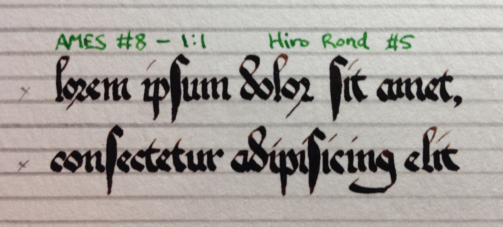
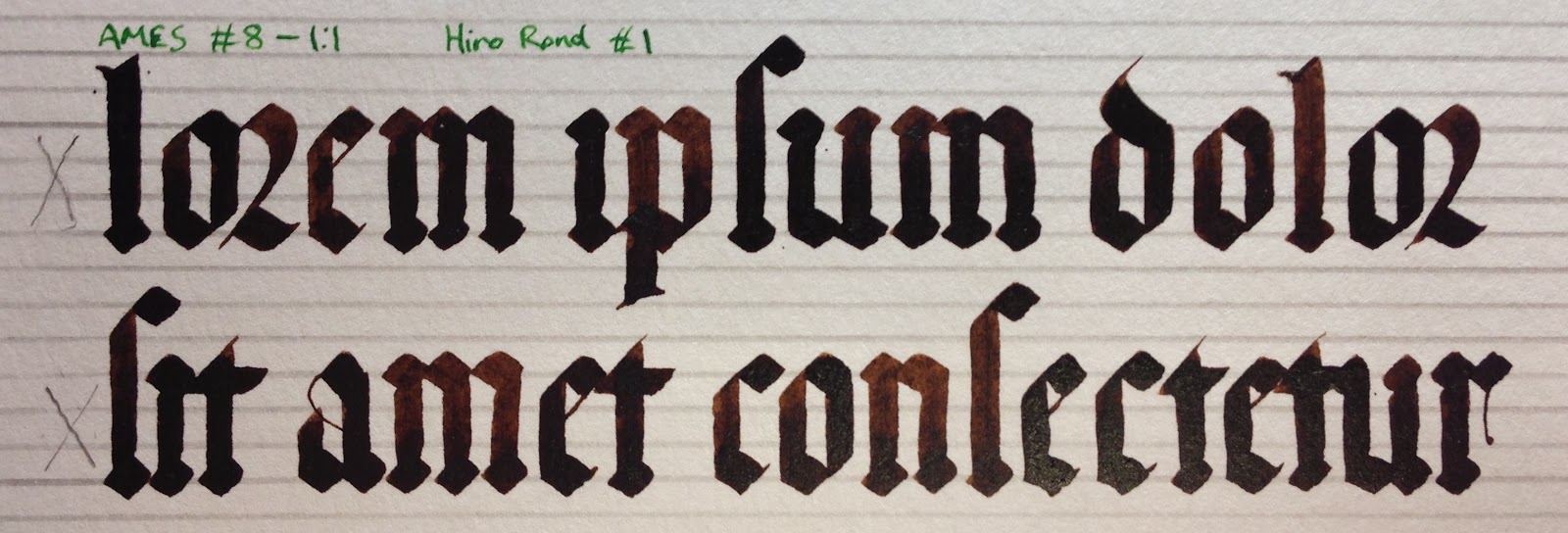
1:1 - Here's an example of a gothic script penned at 1:1 ratio - the minim height and interlinear space are the same height. With gothic scripts, my diamonds at the top and bottom of minim strokes sit on the guideline as I show in my gothic ductus article. For other hands, the tops and bottoms of my minim height strokes just touch the guidelines. Use whichever method works best for you and the script you are using.

1:2 - This is still the 1:1 scale on the AMES guide, but the interlinear space is twice the height of the minim space to make a final ratio of 1:2.
3:4 - This example shows how multiple spaces can be used for both the minim height and interlinear space to create any ratio you need. The final ratio is 3:4. The #1 nib I used is about 3mm wide. I generally only use this method for larger text, as it can be tedious and eye-strain inducing at smaller settings.
1:3 - I used a 1:3 ratio for Sylvia and Ane's Baronial Investiture scroll. Note the tick marks by every fourth space to remind me where the letters go. You can also see how I used the guidelines within the interlinear space to keep the height of my ascenders and descenders (fairly) consistent.

3:5 - These guidelines were drawn with the 3:5 scale on the AMES guide. I included the optional ascender/descender guideline. On the left I added x's to mark the minim space and arcs to mimic those on the AMES guide.

Even with my experience, it sometimes takes me practicing a script for a project with a few different nibs & sets of guidelines before I find the combination that works for me. I plan no writing more in the future about making adjustments and fitting text into a specific space.
Don't be afraid to practice at different sizes and scales. It's the only way to really see the differences for yourself, and to be able to decide which combination looks best for your calligraphy. Also, a little extra practice is never a bad thing...
Lining with a ruler
If you don't have an AMES guide, it's quite possible to line a page with just a ruler and pencil. There are many scribes who only use this method. It is also a useful skill to know for when you have to work somewhere and all you have is a ruler. Be careful if you use this method, as it's possible to end up with lines that aren't square to each other. Your letter height guidelines will also probably not be as consistent as with an AMES guide. Finally, it takes a lot longer to do.
First, you'll need to measure a nib-width minim height reference. This 4 nib-width reference is about 1/8".

Next, figure out where on the ruler you'll need to make marks for your chosen ratio of minim height to interlinear space. For a 1:2 ratio you can either make marks 1/8" followed by 1/4" repeating. Your text would be placed in the shorter space. You could also make marks every 1/8" and place your text every third space. A 2:3 ratio would need marks every 1/8" followed by 3/16", repeating.
To draw the guidelines, start by setting your ruler parallel to and near the left edge of the paper, with 0" lined up with top edge. Make marks according to your chosen ratio. I'm going to make marks for a 2:3 ratio, 1/8" followed by 3/16", etc. Be as accurate as possible in their placement, or your guidelines won't be parallel.
Repeat the process near the right side of the paper. Make sure that the ruler is lined up at the top of the page and you start your marks at the same location.
 |
| Left. |
 |
| Right. |
 |
| Both sides done. |
Carefully line the ruler up against the marks you made, drawing a horizontal line connecting each pair.
 |
| Lines being added. |
 |
| Lines complete. Even being careful, some of the 1/8" spaces for the minims are slightly different heights, and the last space for minims is a little lower on the right side than the left. |
Using a T-square & drafting board
The T-square allows you to quickly draw lines that are perpendicular to the edge of the drafting board it is placed against. This means you only need to measure and mark the paper once.
A drafting board is anything you can tape your paper to and has straight edges to use the T-Square against. Purpose-built drafting boards are expensive. I use cut down pieces of MDF from the home improvement store.
The first step in using the drafting board is to tape the paper to the surface. To make this easier, I've penciled lines one inch in from the edge of the board. When I place the paper onto the board I line up the top and left edges with these 1" margins before I tape it down. This does two things for me:
- it insures the edges of the paper are square to the edges of the board;
- by having the paper exactly 1 inch from the edges, I can use my ruled T-square to easily measure for margins or other lines.

You can then use a T-square to make your guidelines. This is faster than with a ruler, and should insure your lines are parallel to one another. Start by making reference lines down one side of the paper.

Then align the T-square with those marks to draw your lines. You still have to be careful about keeping them spaced correctly, but they should at least be parallel if the T-square is held firmly against the side of the drafting board.

Drawing guidelines with the AMES lettering guide
I specify the use of a T-square and drafting board in my instructions. You can use the AMES guide with a ruler instead; it just takes more time to adjust the ruler so it is horizontal in step 1, and to line up the hole with the previous line in step 4.
During this process, resharpen your pencil as needed to keep the lines thin and crisp. My example photos continue to use a normal mechanical pencil so the guidelines are easier to see.
Rest the bottom of the AMES guide against your T-Square, and place the top hole of the scale you are using where you want your first guideline to be.
 |
| I'm pointing to the top hole in the 2:3 scale that I'll be using in these photos. |
Hold the T-Square firmly in place with one hand. Start with the AMES guide is all the way to one side of the text area. Place the tip of your pencil in the top hole of your chosen scale, and slide the AMES guide along the top of the T-Square to the other side of the text area drawing a line as you go. You want the minimum amount of pressure necessary to make the line and keep the AMES guide sliding against the T-Square.

Move the pencil to the next hole down on the scale you are using, and repeat the process.
When you have drawn a line using the last hole in the scale, slide the T-Square and AMES guide down the drafting board so that the top hole of the scale is now lined up with the last line you drew. Repeat from step 2 until you are done lining all of the text area.
That's it! The drawing of lines with the AMES guide is actually pretty easy. Choosing a scale and adjusting the height based on the nib width you plan on using takes a little bit of knowledge and experience.
Used correctly and with a T-square, the AMES guide insures that your lines are spaced perfectly and are all parallel to one another. The only time the spacing can be off is when you are lining the guide up against a previous set of guidelines.
If the above isn't quite clear and you want to see the AMES guide in action, here's a video of the process.
Dealing with Versals
A Versal is a decorative capital letter that usually spans more than one line of calligraphy in height. Here's an example of a Versal "R" from the word "Regina" in the Prayer Book of Michelino Da Besozzo:

If your text is going to have a Versal in it, you need to plan space for it and insure that your guidelines are aligned properly with the space for the Versal. You also need to remember to start the calligraphy on the second letter of the word that starts with the Versal!... There are two methods for setting aside space for a Versal:
Guidelines first, then Versal - This method is required if the Versal appears in the middle of the text like in the example above. The final size of the versal is determined by how many lines of text it spans. Sometimes, you may not be sure which lines the versal will be on. Pen the text up to the point where the versal needs to go, then measure and place it before continuing with the calligraphy.
Versal first, then Guidelines - This method only works if the Versal is the first letter of the text. It requires that you line up your first guideline against the bottom of the Versal space, and go up and down from there to complete the rest of the guidelines. Here's a video of both methods being demonstrated:
Vertical guidelines
Finally, there are a few types of vertical guidelines you might want to consider adding to your page once the horizontal guidelines are in place:
Vertical reference lines - If you are writing in a script like gothic that has a lot of vertical strokes that need to be precise, add some vertical guidelines to use as a visual reference. You can use a T-square vertically against the top edge of your drafting board, or hold a drafting triangle or AMES guide against a horizontal T-square.

Slanted reference lines - Some scripts like Italic or even some Gothic Secretary scripts have strokes at a slanted angle. To keep those strokes consistent across the entire page, add slanted guidelines! The AMES guide has an angled edge that allows for 68° lines to be drawn easily. There are also drafting triangles with fixed angles of 30°/60° or 45°, or an adjustable triangle that can be set to any angle between 0° and 45°.

You can of course draw in both vertical and slanted guidelines if your script uses both. If your calligraphy will be surrounded with painted margins, I also recommend leaving a little bit of space between the paint and calligraphy. I draw vertical guidelines 1/8" in from anywhere paint and calligraphy will be side by side, including next to versals.
Final thoughts
This article was a bear to write! It's one of the first articles I wanted to write when I started this blog, and I've been working on it for weeks.
My original intent was to quickly explain how to use the AMES guide to draw guidelines for calligraphy. As I continued writing, I found that I felt additional knowledge was required. I added information on how to use drafting tools such as the T-square; the relationship of minim height to nib widths; and choosing the correct ratio of minim height to interlinear space.
Editing has been a struggle as well. I have a propensity for verbosity, and I worked hard to strip out the excess words. The order of the sections has changed many times as well as I attempted to determine the most natural progression from subject to subject. I also considered splitting it up into more than one article.
In the end, I decided that all these subjects are interrelated such that separate articles would have been difficult. I also decided that they deserve explanation, especially for those newer to calligraphy.
If you have read all the way to this point, thank you! I know this article was long, and I sincerely hope it provided at least some information that was helpful.
When you have drawn a line using the last hole in the scale, slide the T-Square and AMES guide down the drafting board so that the top hole of the scale is now lined up with the last line you drew. Repeat from step 2 until you are done lining all of the text area.
 |
| Here I'm pointing to the second hole in the 2:3 scale. The first hole is lined up on the last line. |
That's it! The drawing of lines with the AMES guide is actually pretty easy. Choosing a scale and adjusting the height based on the nib width you plan on using takes a little bit of knowledge and experience.
 |
| When finished, I mark the minim spaces just to make sure I place the text properly. |
Used correctly and with a T-square, the AMES guide insures that your lines are spaced perfectly and are all parallel to one another. The only time the spacing can be off is when you are lining the guide up against a previous set of guidelines.
If the above isn't quite clear and you want to see the AMES guide in action, here's a video of the process.
Dealing with Versals
A Versal is a decorative capital letter that usually spans more than one line of calligraphy in height. Here's an example of a Versal "R" from the word "Regina" in the Prayer Book of Michelino Da Besozzo:

Guidelines first, then Versal - This method is required if the Versal appears in the middle of the text like in the example above. The final size of the versal is determined by how many lines of text it spans. Sometimes, you may not be sure which lines the versal will be on. Pen the text up to the point where the versal needs to go, then measure and place it before continuing with the calligraphy.
 |
| Measuring across three minim heights equals about 13/16". |
 |
| For a square versal, I place a mark 13/16" from the left edge of the text area. |
 |
| A square versal space spanning three lines of text is created. Versal space can span into the ascender and descender space as well, or just from the top of the first minim space to the bottom of the last, as shown above. |
Versal first, then Guidelines - This method only works if the Versal is the first letter of the text. It requires that you line up your first guideline against the bottom of the Versal space, and go up and down from there to complete the rest of the guidelines. Here's a video of both methods being demonstrated:
Vertical guidelines
Finally, there are a few types of vertical guidelines you might want to consider adding to your page once the horizontal guidelines are in place:
Vertical reference lines - If you are writing in a script like gothic that has a lot of vertical strokes that need to be precise, add some vertical guidelines to use as a visual reference. You can use a T-square vertically against the top edge of your drafting board, or hold a drafting triangle or AMES guide against a horizontal T-square.

Slanted reference lines - Some scripts like Italic or even some Gothic Secretary scripts have strokes at a slanted angle. To keep those strokes consistent across the entire page, add slanted guidelines! The AMES guide has an angled edge that allows for 68° lines to be drawn easily. There are also drafting triangles with fixed angles of 30°/60° or 45°, or an adjustable triangle that can be set to any angle between 0° and 45°.

You can of course draw in both vertical and slanted guidelines if your script uses both. If your calligraphy will be surrounded with painted margins, I also recommend leaving a little bit of space between the paint and calligraphy. I draw vertical guidelines 1/8" in from anywhere paint and calligraphy will be side by side, including next to versals.
 |
| Vertical guidelines added 1/8" in from the edge of the text space and versals to insure even whitespace between the painted areas and calligraphy. |
Final thoughts
This article was a bear to write! It's one of the first articles I wanted to write when I started this blog, and I've been working on it for weeks.
My original intent was to quickly explain how to use the AMES guide to draw guidelines for calligraphy. As I continued writing, I found that I felt additional knowledge was required. I added information on how to use drafting tools such as the T-square; the relationship of minim height to nib widths; and choosing the correct ratio of minim height to interlinear space.
Editing has been a struggle as well. I have a propensity for verbosity, and I worked hard to strip out the excess words. The order of the sections has changed many times as well as I attempted to determine the most natural progression from subject to subject. I also considered splitting it up into more than one article.
In the end, I decided that all these subjects are interrelated such that separate articles would have been difficult. I also decided that they deserve explanation, especially for those newer to calligraphy.
If you have read all the way to this point, thank you! I know this article was long, and I sincerely hope it provided at least some information that was helpful.
-Alexandre
No comments:
Post a Comment