
| Project: | Tyger of the East for Duchess Anna Ophelia Holloway Tarragon |
| Words: | Lady Adrienne d'Evreus |
| Translation: | Master Steffan ap Kennydd |
| Calligraphy: | Lord Alexandre Saint Pierre |
| Illumination: | Lord Alexandre Saint Pierre |
| Paper: | 9" x 12" Parchment by David de Rosier-Blanc |
| Script: | Gothic Quadrata main text, Gothic Secretary Interlinear gloss. |
| Pens: | ~1mm Goose Quill for primary text, pointed metal nib for gloss & outlines. |
| Inks: | Ian the Green's Iron Gall and Brazilwood inks. |
| Inspiration: | folio 144v of MS Typ 0193 at the Houghton Library. |
Signet: "Hey Alexandre, would you be able to accept an assignment for a Tyger of the East scroll?"
Me: "Sure! Any input for words or style?"
Conspirator: "Something appropriate to her persona."
Me: ...
The Tyger of the East is an award "given by the Crown to the individual who most embodies and personifies the ideals of the East Kingdom." It can only be given once per reign. To say it's a big deal would be a massive understatement. So, no pressure...
Without much to go one, I started browsing digital scriptoria for examples of late 13th/early 14th century examples that spoke to me. I finally found and settled on this page to use as an inspiration:

Leaving the last line blank for signatures meant I had a limit of about 45 words. How does one impart the gravitas of such an accolade? Latin!
Sadly, I am not fluent in medieval latin, so I reached out to Master Steffan to ask for his assistance. He replied that he would happily translate if I provided English words.
I turned to my lady and asked for her assistance. She came up with the original English wording:
An Eastern Tiger in Truth
All hear tell of Anna Ophelia
Halloway Tarragon.
Mother, duchess, equestrian.
She is a shining beacon,
a paragon of virtue,
an example for us all
in either peace or war.
Thus we, Brennan & Coailfhionn
swiftly name her a Tyger of the East
on this xxx of January, a.s. l.
Steffan quickly returned a latin translation.
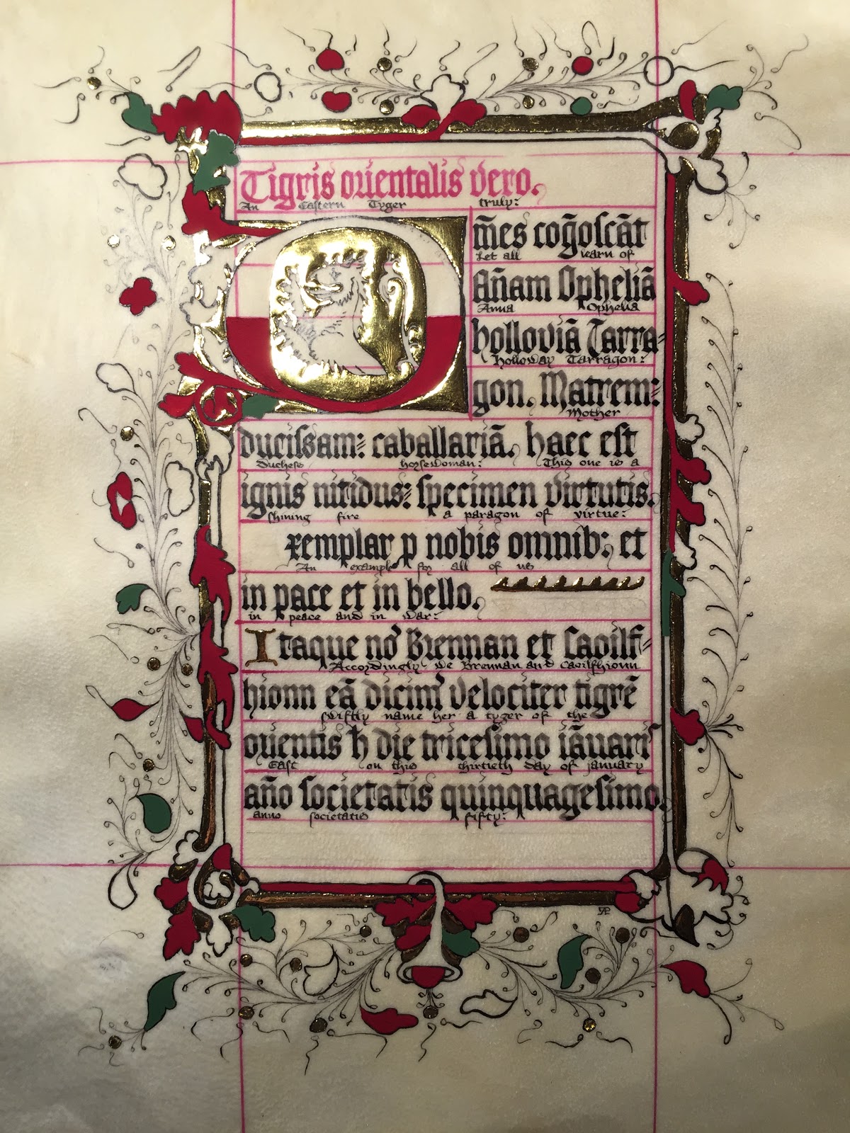
Omnes cognoscant Annam Opheliam Holloviam Tarragon.
Matrem, ducissam, caballariam.
Haec est ignis nitidus, specimen virtutis
Exemplar pro nobis omnibus
Et in pace et in bello
Itaque Nos Brennan et Caolfhionn
Eam dicimus velociter
Tigrem Orientis
Hoc die XXX [tricesimo] Januaris anno Societatis L [quinquagesimo].
I used this article on common latin abbreviations. Some of the abbreviations I used include:
- A little curlycue above the last letter of a word to indicate a missing -s or -us.
- A tilde (~) above a letter in the middle of the word to indicate a missing m or n after it.
- A tilde above the last letter of a word to indicate a missing -n or -m.
- A tail on the left side of a p to indicate the word "pro".
- A b followed by a semicolon to indicate the suffix -bus.
- An h with a hyphen through the ascender to indicate the word "hoc" or "haec".
Time to practice! I set my Ames Guide to match a printout of the original, at actual size. The pencil lines are just under a quarter of an inch apart. The darker lines show where the ink lines will be.
For my practice run, I ended up using more and different abbreviations than I did on the final version. I had two blank lines at the bottom, and only needed one.
The latin text was penned with a 1mm nib to match the original. Then I used a pointed metal nib to write the English text under the latin in a secretary hand a couple of millimeters tall. While the original didn't have this detail, it's common enough that I felt it was an appropriate way to allow Anna to be able to read the text.

First with a pencil and my Ames guide, then using a pointed quill and Ian's Brazilwood ink, I lined the parchment.

Then I started the calligraphy.

And continued. And oh [expletive]! I skipped a line!

[Expletive] [expletive] [expletive]!
Deep breaths. One of the great benefits of working on parchment is that it's possible to "erase" mistakes.
I started by blotting up any still-wet ink with a paper towel.
Then I used an X-acto knife to scrape off much of the ink.
I used an abrasive nail buffing block - a sponge with a fine abrasive outer surface - to sand the area smooth and free from any remaining ink.
Once ink free, I burnished the surface smooth with an agate burnisher I use for gold leaf.
Finally, I pounced the surface (again) with dental pumice and gum sandarac.

I touched up the red ink lines, and finished the calligraphy, starting on the correct words this time... I mostly chose which abbreviations to use as I wrote, based on what I needed to fit on each line.

Using a light box, I traced from a printout of the original onto some tracing paper in pencil.

I attached the tracing to the back of the parchment and placed it back on the light box, and drew the ink lines on using a pointed metal nib and Ian's Iron Gall ink.

I opted to use the inside of the O for the symbol of the award. Once I was done with the ink work, I taped the parchment to a small piece of MDF to prevent it from curling.

Next, I applied several thin layers of Miniatum for the raised gilding, waiting at least 12 hours between each layer. I thin my miniatum with yellow ink and water so I can see where I'm painting it, and to allow me to apply it in thin enough layers. Too thick and the surface of the Miniatum will pucker or ripple as it dries.

The yellow coloring makes it fairly easy to put down the first layer. The real challenge when applying Miniatum is the subsequent layers. I position a light low and opposite the piece so it reflects off the miniatum. On the inside of the O, you can see how the wet Miniatum is shinier than the dry previous layer in the corners.

About 6 hours after the final layer of Miniatum is dry, it's time for gilding.


With the gilding done, it was time to figure out the color palette so I could start painting. The original uses darker base colors than I'm used to. I started by "painting" samples of several different colors of gouache I had available.

With Adrienne's help, I mixed up a dark green and blue that we felt matched closely enough. For red, I used straight Alizarin Crimson.

I started with the dark color as a base. Green went quickly, followed by red.
Then blue.

Then I started shading with the green and a few of the red that had a yellow/brown highlight, instead of the traditional white.

And red.

And blue.

Finally, I added the whitework, and the scroll was done.

Final Thoughts
I feel like I need a lot more practice with shading, or at least to learn some technique instead of brute forcing it. Despite that, I managed to get results I was happy with.
Working with latin was great fun, even if I did have to correct a mistake by not paying close enough attention...
No comments:
Post a Comment